Your booking page, profile and client area can wear your own colours instead of the standard MassageHub palette, so the whole experience feels like your brand from the first click.
Setting your colours
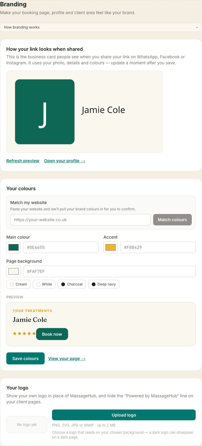
Go to Settings → Branding. Choose a main colour (used for buttons, links and highlights) and an accent (used for small touches like stars and labels). A live preview shows exactly what your clients will see as you change them, and you can reset to the defaults at any time.
Light or dark — your background
You can set the page background too, light or dark. Pick a shade (or tap a preset like Charcoal or Deep navy for a dark look), and the text, cards and borders adjust automatically so everything stays readable — a dark background gets light text, a light one gets dark text. There's nothing else to set.
To keep your pages legible, a mid-grey background that can't carry readable text is gently refused, and a main colour that's hard to read on your chosen background prompts you to pick a deeper or lighter shade. The live preview always shows exactly what your clients will see.
Match my website
Paste your website address and tap Match colours — we'll read your site and pull your brand colours in for you to confirm. It works best on cleanly-built sites; if we can't pick them out, just choose your colours by hand.
Your own logo (Plus)
On the Plus plan you can also hide the “Powered by MassageHub” line and the MassageHub mark, and upload your own logo to show in the header of your client pages. Upload a PNG, SVG, JPG or WebP up to 2 MB — and choose a version that reads well on your background.
Text size (Pro) and font (Plus)
In Settings → Branding, Text size sets the size of the body text on your public profile and booking page, from 12px to 17px. 14px is the standard. Headings and prices scale with it, so the whole page tightens or opens up together — useful if your treatment descriptions are detailed and you want more on the first screen.
On Plus you can also choose the Font, from nine options. Classic is the MassageHub default: serif headings with clean body text. The other eight set the whole page in one typeface — Inter, Fraunces, Lora, Source Serif, Baskerville, Work Sans, Poppins and Nunito. Each one previews with your own name and a real line of copy, so you can see it rather than imagine it. They're all chosen to stay readable at small sizes, so your service descriptions don't suffer for the sake of a heading.
Your clients can adjust the text size for themselves too, using the small A A A buttons at the top of your profile and booking pages. That's free and always available, it's remembered on their device, and it works alongside your own setting rather than replacing it — so someone who needs larger text still gets it even if you've chosen 12px.
How your link looks when shared
When you share your booking link on WhatsApp, Facebook or Instagram, it now previews as a tidy business card — your photo, your name, your location and your contact details, all in your own colours. In Settings → Branding you'll find a How your link looks when shared preview showing exactly what people see. It updates a moment after you save your photo, details or colours, and there's a Refresh preview link if you'd like to check straight away.
Who sees it
Brand colours come with Pro, and the logo and white-label options come with Plus. Your clients always see your chosen branding on your public pages; nothing changes about how booking, payments or reminders work.